01 — Understanding the brief
The goal
The goal of this project was to create a modern and visually engaging
landing page for a photography studio. The design needed to clearly
present the studio's services, showcase portfolio work, and provide
a seamless path for potential clientsto book a session.
After reading the brief carefully, I opened Figma, organized my
works pace and began mapping out the project into clear
phases: research, wireframing, and visual design.
Project goals
✓
Communicate studio identity
✓
Show photography style clearly
✓
Enable fast, intuitive booking
✓
Leave a creative, professional impression
02 — Research & inspiration
Moodboard
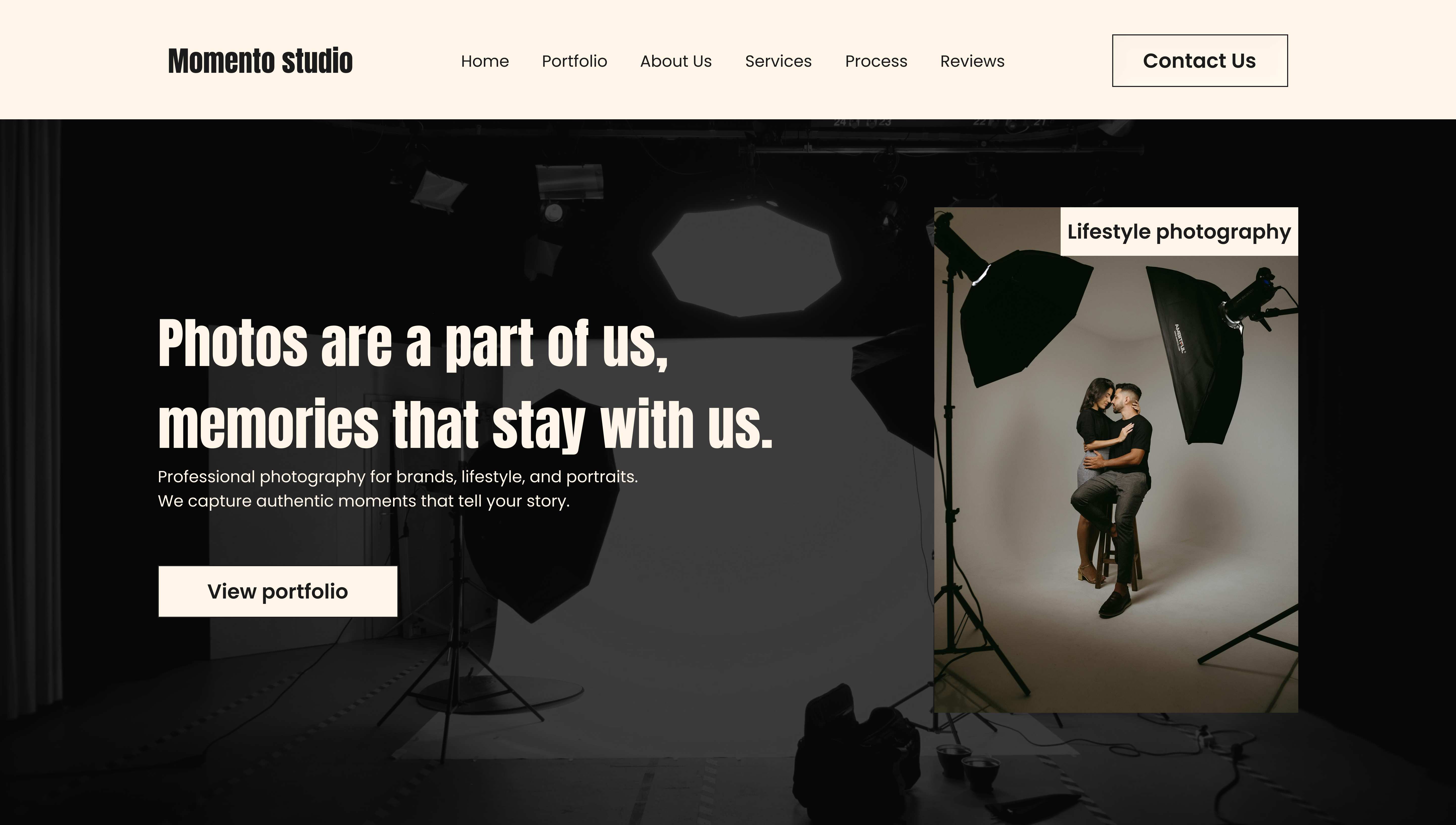
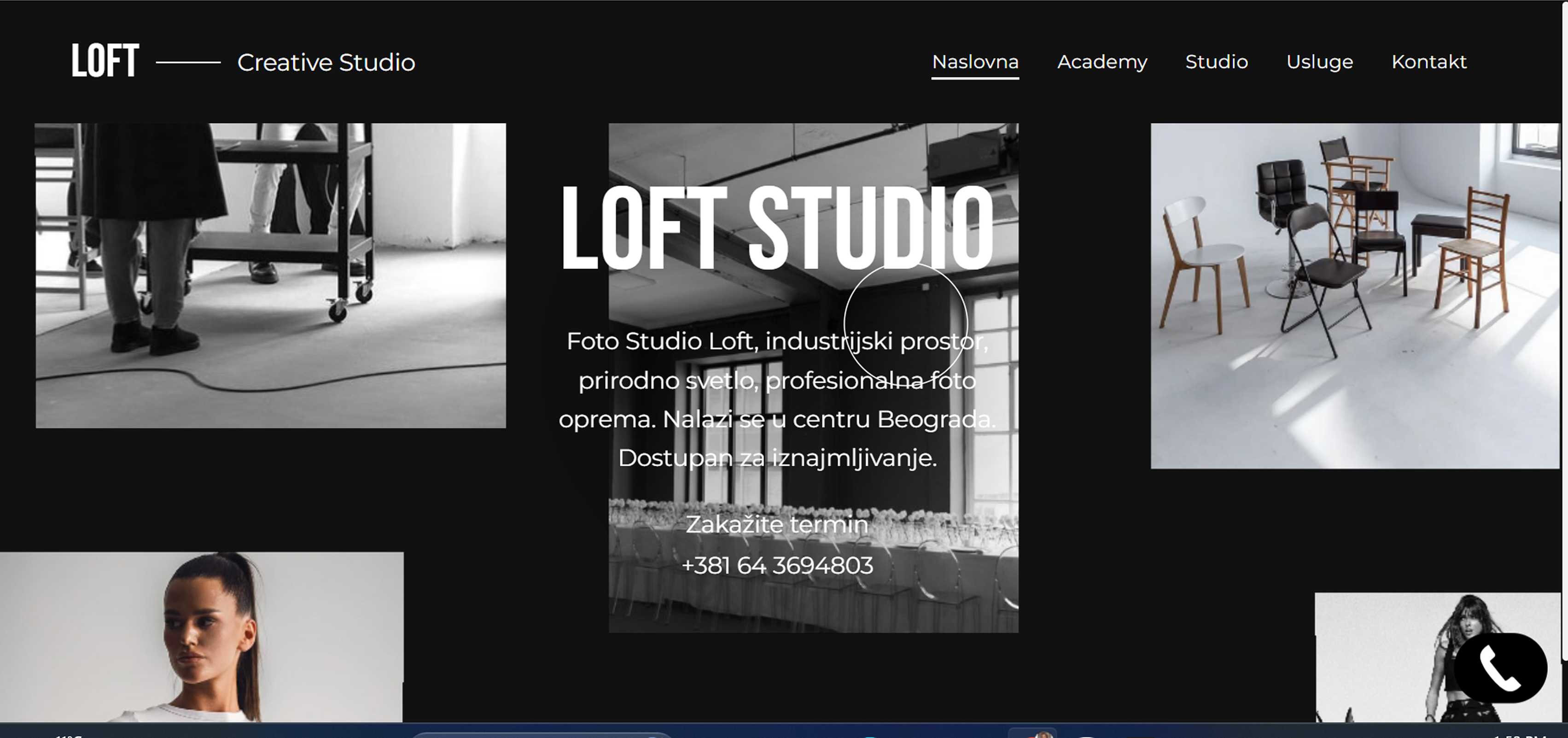
I explored photography studio websites to analyze structure, content and user experience. This research helped identify industry patterns and opportunities for a creative, professional landing page.
Hero section
Strong first impression
I was inspired by how photography websites use full screen visuals to quickly establish mood, identity, and focus, making the experience clear from the first moment.
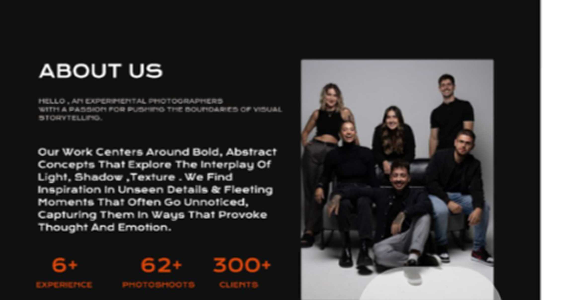
About section
Photo storytelling
I liked how some studios present their team through portrait imagery and brief descriptions, which makes the brand feel more human, approachable, and real.
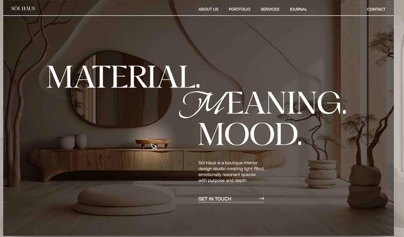
Typography
Editorial style
I was inspired by how photography studio websites use refined typefaces to add emotion and a more premium, expressive feel that fits the visual nature of photography.
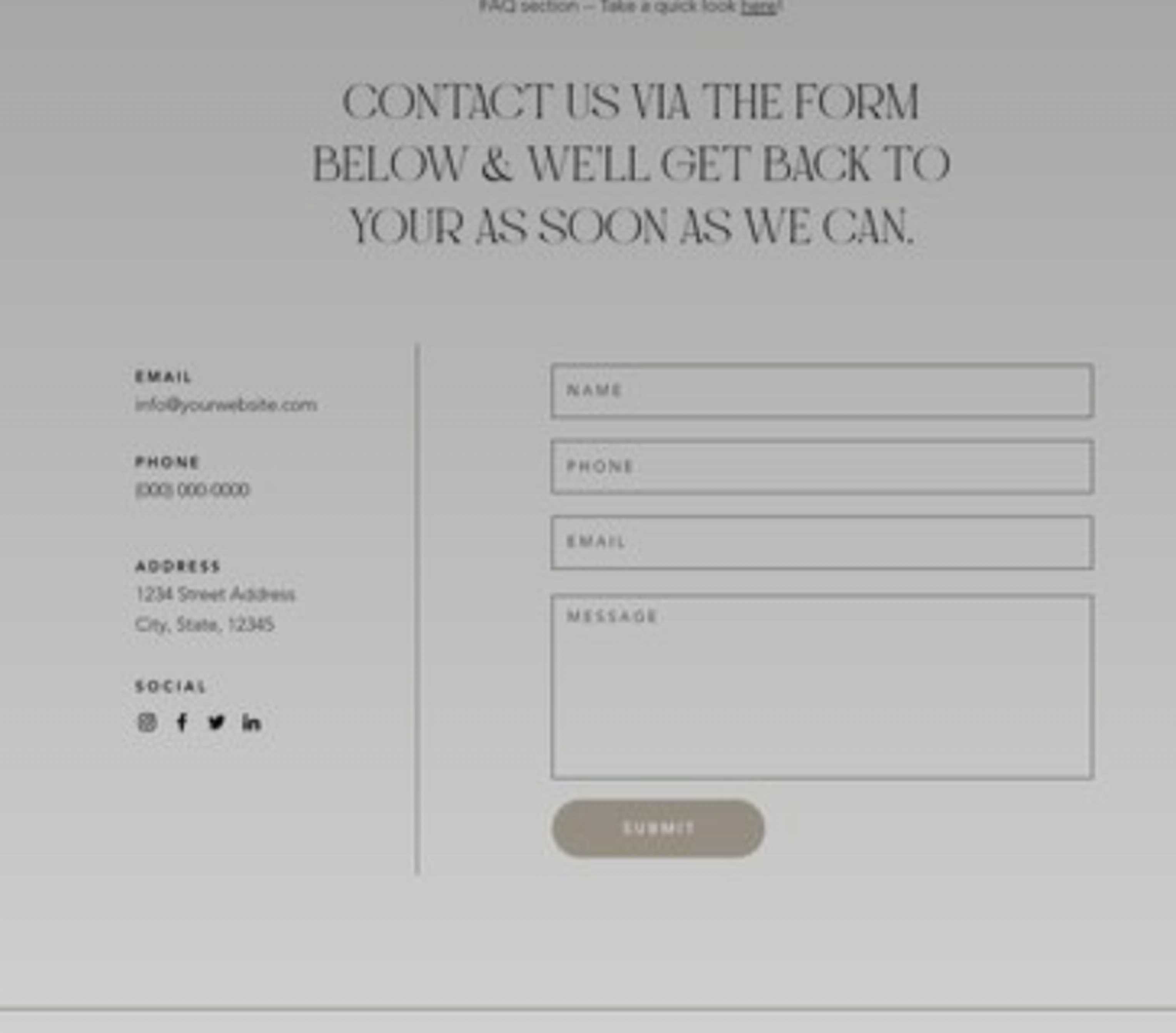
Contact us
Spacious Layouts
In this reference, I was inspired by the way the contact form is presented in a clean and structured layout. It gave me inspiration to design a more refined and visually engaging contact section.
03 — Wireframing
Low-fidelity structure
With sketches validated, I moved into Figma to build low-fidelity wireframes.
The focus was on structure, spacing rhythm, hierarchy and CTA placement.
04 — Design system
Design system
A minimal visual system built around high contrast typography,
warm neutral tones, and reusable UI components.
05 — Final design
Final interface
The final UI combines all research, wireframes and design decisions into a refined, production-ready interface focused on clarity, hierarchy and visual rhythm.
View full in Figma →
View full in Figma →
View full in Figma→
View full in Figma →
06 — What I learned
Designing with clarity and purpose
This project helped me improve my understanding of visual hierarchy, content structure, and responsive design, as well as how users can easily find what they need.
01 / First impression
Hero clarity
Designing the hero section taught me how important it is to communicate the studio's purpose immediately. By clearly presenting what the business offers from the first screen, visitors can quickly understand the value of the service without searching for information.
02 / Service communication
Clear services
One of the most important lessons was structuring the services section. Presenting each service with clear information, transparent pricing, and a visible booking action helps users compare options quickly and move confidently toward booking a session.
03 / Consistency
Structure creates
Throughout the project, I refined spacing systems, typography scales, and visual hierarchy to create a more cohesive interface. I also learned how to adapt the desktop design into a responsive mobile experience while maintaining clarity, consistency, and usability across different screen sizes.